Lane diagrams
A lane diagram is a technique I developed to understand how a street functions, or could function. Function is a fundamental part of street design. Streets are not static places, they are places of movement. Understanding movement presages possibilities.
Lane diagrams are drawn in CAD, so they are more accurate than a sketch but faster to produce than actually drawing the street. Because the drawing is measured, including turn radii, one can quickly move to a drawing with curbs and centerlines and crosswalks. By plotting lanes over an aerial, one can easily compare the existing to the proposed.
In the lane diagram below, we explored adding bike lanes (green lines) and midblock crossings (blue lines and yellow islands) to a stretch of road while converting a roundabout into a T-intersection. The orange lines are the vehicle paths.
Lane diagram of a road diet with bike lanes
At the intersection level, lane diagrams help to understand traffic operations. In the example below, each line represents a potential movement, but is not lane specific. One can see a jumble of activity in particular parts and gaps elsewhere. I generally use the same palette of colors: blue for people walking or using a mobility device, green for people on bikes and scooters, purple for transit, and orange for motorized vehicles. Incidentally, we included this in the NACTO USDG.
Lane diagram of intersection showing all modes, plus where people actually walk
The blue lines represent not only where people “should” walk (as pre-ordained by crosswalk markings) but also where they tend to walk (aka desire lines). This troubles many in the traffic profession who are under the misguided belief that people always do what they are told. Rather than ignoring reality, I map where people actually walk to understand movement, in hopes of making it safer.
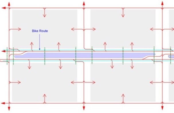
Lane diagrams are useful to show adjacencies. Traffic generally flows from somewhere to somewhere, and changes may have implications elsewhere in the network. This applies to bike and bus traffic as well. In this example, there are multiple bicycle routes (blue), existing and proposed, and the lane diagram allows one to explore implications. Similarly, I show bus turn in purple - good to know when altering intersections.
Lane diagram showing adjacencies - what will be affected up and down stream
Lane diagrams can provide a better picture of traffic volumes. Typically the volume of a street is shown as a total number. But 1000 cars on a 10 lane street is different than 1000 cars on a one lane street. By showing the volume per lane, one gets a more accurate picture of the situation and is able to quickly determine the pinch points. In the example below, we mapped each lane then calculated the volume per lane. Yellow has a low volume/capacity ratio, while brown is high.
Lane diagram showing volumes per lane
A variant of the lane diagram is a street operation diagram, which is useful in understanding and/or planning a multi-modal circulation network. The diagram below identifies signalized junctions, midblock pedestrian crossings (which will need some type of traffic control), locations of U-turns (left turns are banned on transit corridors), locations for exclusive right turn lanes (where there are heavy right turns), and tram lines/stations. Shown on a map, the street operation diagram allows one to quickly understand how the streets will function, and where there might be issues to mitigate.
Lane diagram showing traffic operations
In the last example, we used a lane diagram to explore the impacts of a median and access management techniques on operations. The top drawing shows a typical street with numerous left turns, driveways, and subsequently conflict points. This particular situation is typical of many highways that have been enveloped by suburban sprawl – but still maintain highway-like operations. Basically the road needs to grow up.
The drawing on the bottom shows the same street with a median, bike lanes, crosswalks, aka a complete street. Left turns have been consolidated into turn bays. Access to the surrounding properties is made from the side streets or the next street over (much as a city grid functions). The median enhances the experience for people crossing the street. Fewer driveways and left turns increases safety and comfort for cyclists.
Lane diagram showing impacts of median and turn restrictions - BEFORE
Lane diagram showing impacts of median and turn restrictions - AFTER
Thanks to a number of people and places who have helped with lane diagrams over the years: Stephanie Wright, Abu Dhabi Urban Planning Council, City of Philadelphia, Design Workshop, East West Gateway, NACTO, Nelson\Nygaard, and others.


