Mobility Networks
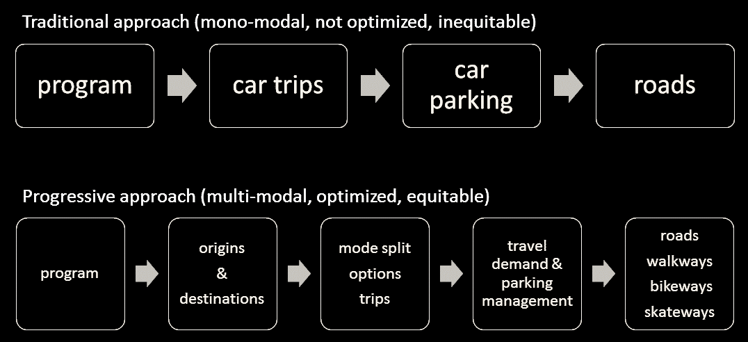
A mobility network is how we move around town. At the heart of the auto-centric system’s success is simplicity. Your car goes everywhere, and the American city has been (re)designed to accommodate. A similar level of simplicity will be necessary for a multi-modal system of mobility to succeed.
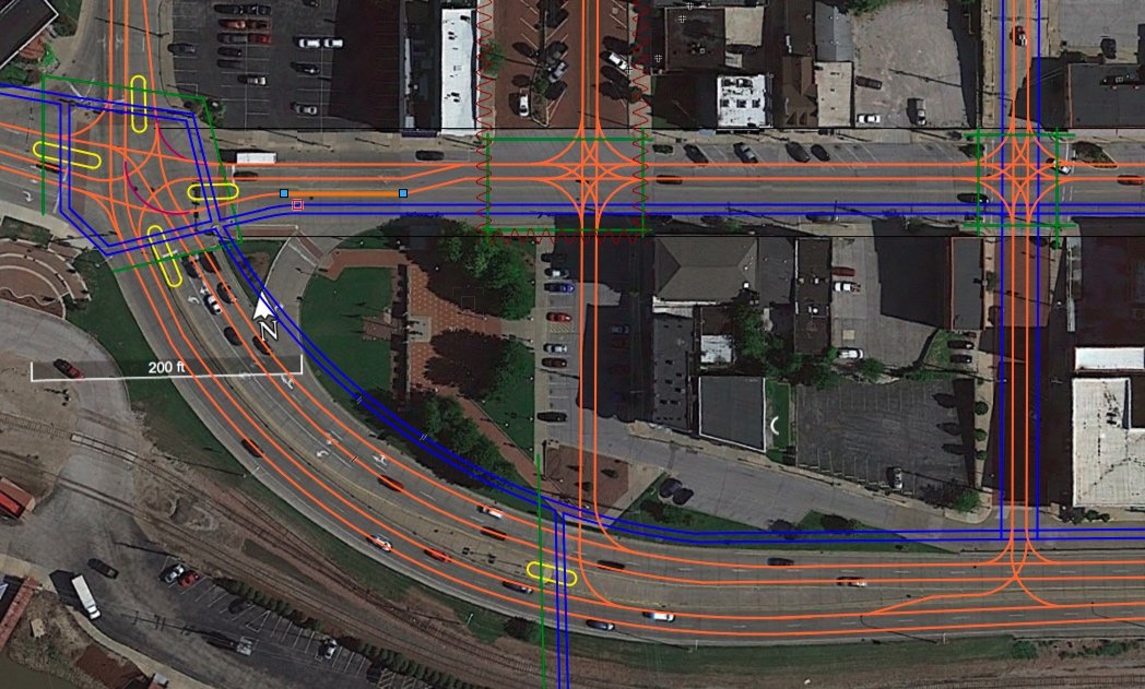
Alton, Illinois (USA), 2020
“Great Streets” project to reinvigorate Broadway through downtown Alton. This drawing shows how the various modes (walking = blue, cycling = green, driving = orange, transit = purple, yellow = crossings) circulate and intersect. Diagraming the movements facilitate design and identify issues. More info.

Make Way for Lower Manhattan
Effort to capitalize on Lower Manhattan’s organic walkability, 2018.
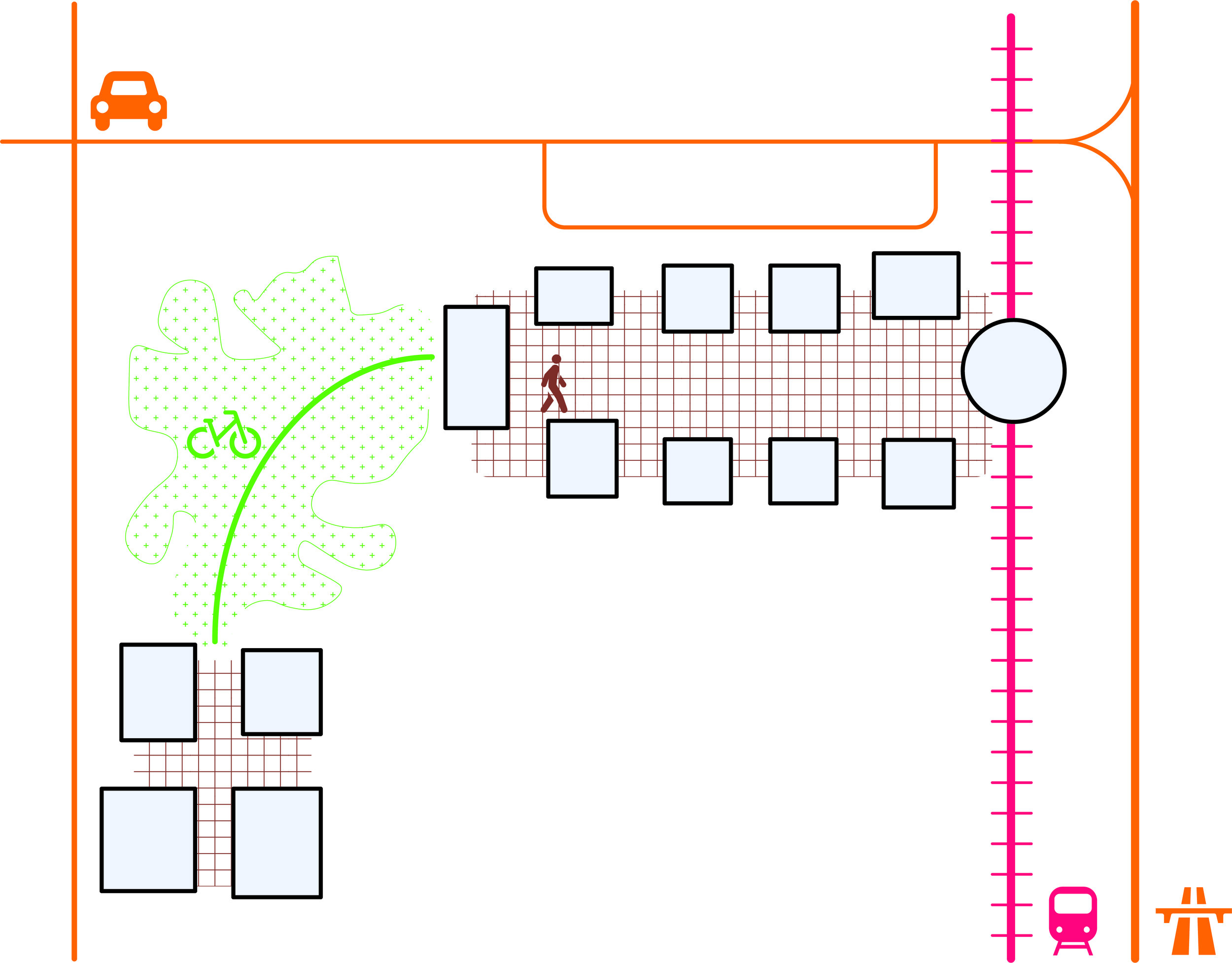
Ideal campus mobility
This diagram illustrates ideal mobility on a typical campus. At the heart of the campus is a pedestrian zone with transit access. Nearby is auto parking and bicycle facilities. Connecting the main campus with the satellite is a bike path. Autos are limited to peripheral roads and may not cross the campus.
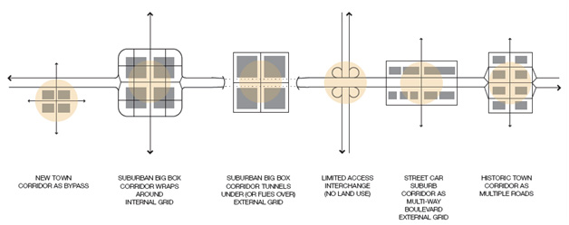
Intersection typologies
Diagraming the way in which a corridor passes through various contexts helps to explain the various designs necessary along the corridor. This example is from the Manchester Road Great Streets Master Plan in St Louis MO.
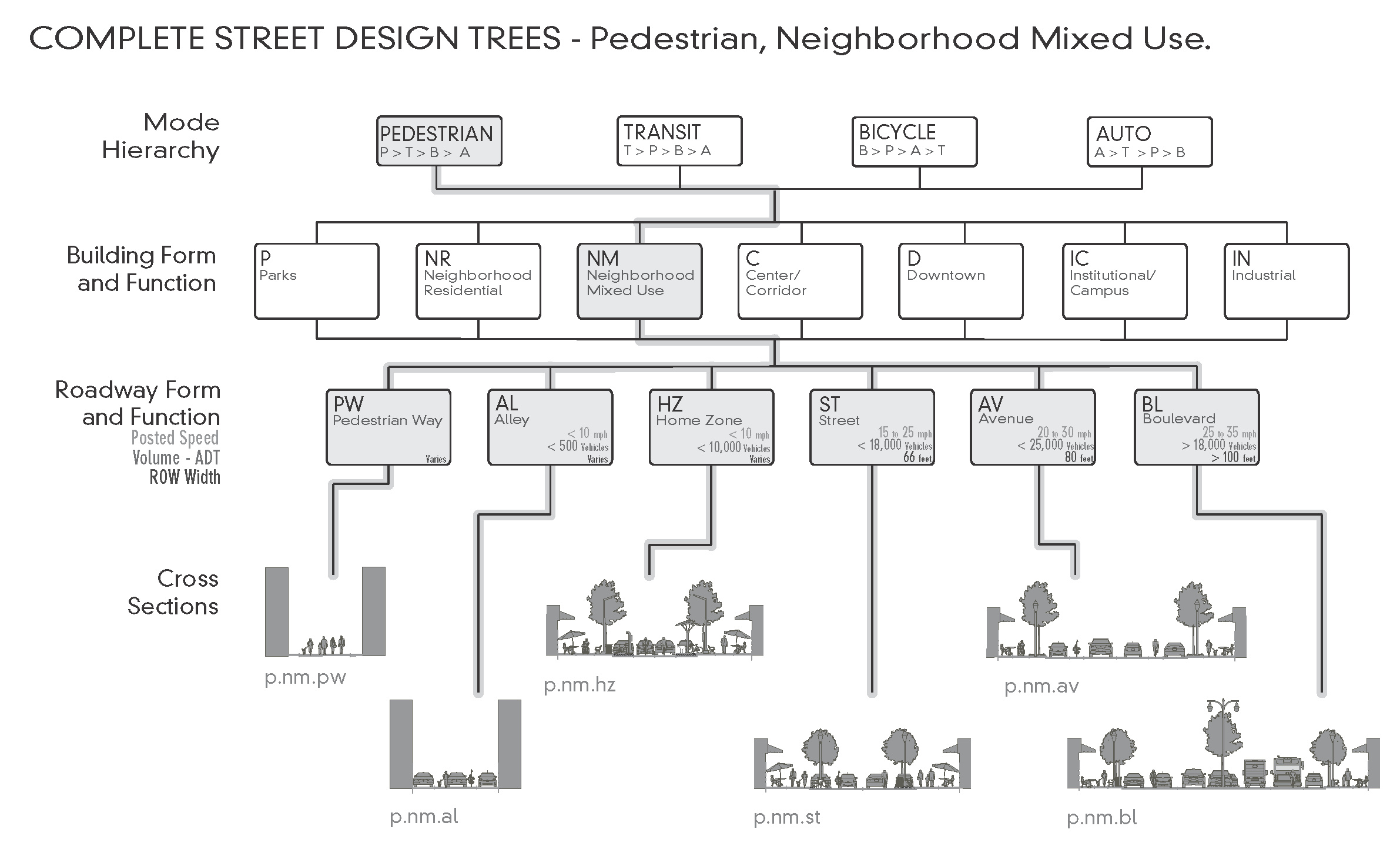
Street design tree
The design tree is a technique from the Chicago Complete Streets guide that we “borrowed” from the 2006 German Street Design Manual (Richtlinien für die Anlage von Stadtstraßen) to articulate how to choose a cross-section based on a set of discrete inputs: ROW width, priority, context, and characteristics.
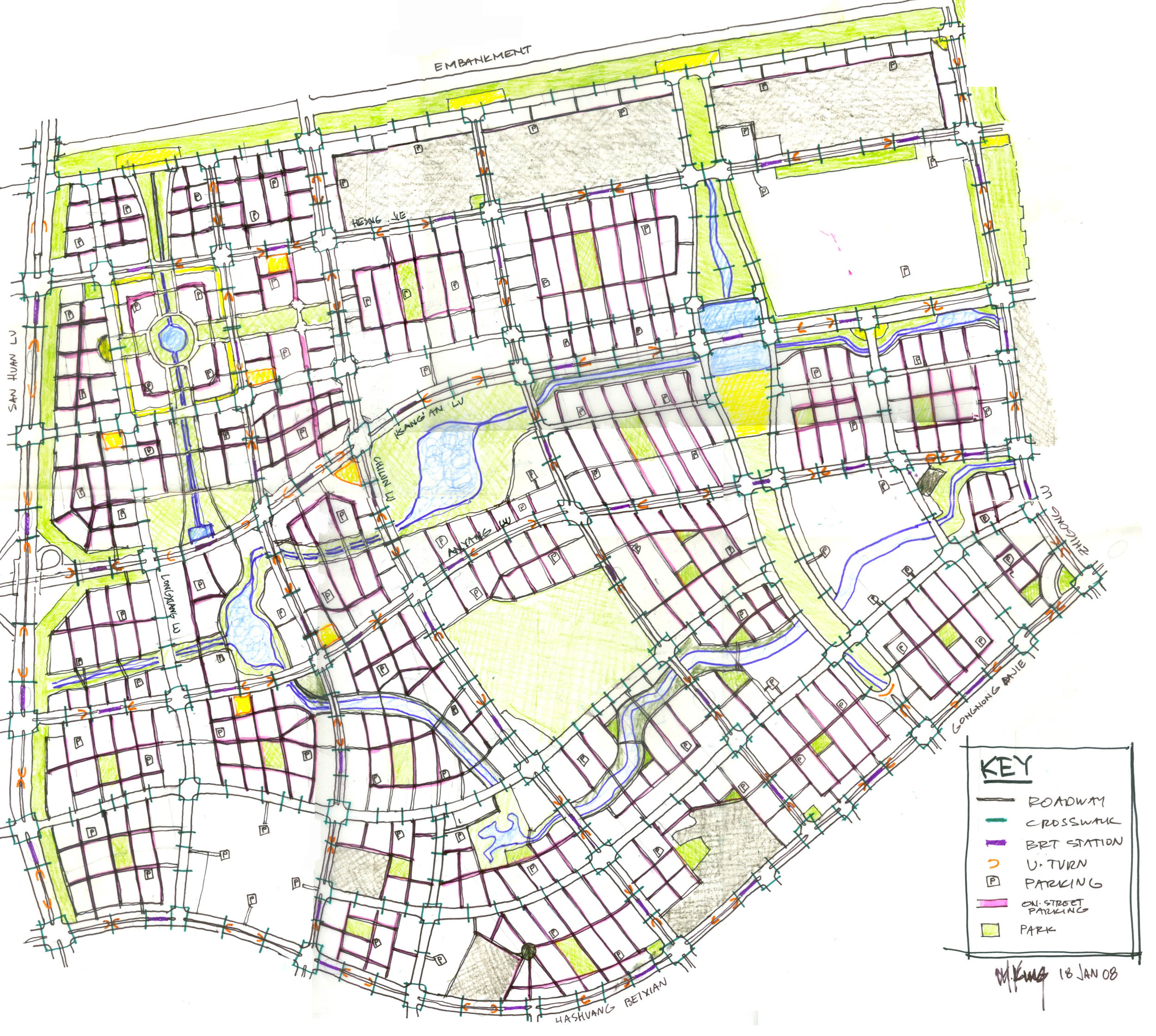
District street network
In preparing the street network for the Qunli District, a new 300,000 person mixed use area in Harbin (China), we focused on orienting the streets to maximize sun exposure, minimize wind, provide the quickest route to the transit stations, weave a network of parks and trails, and create interesting view corridors.
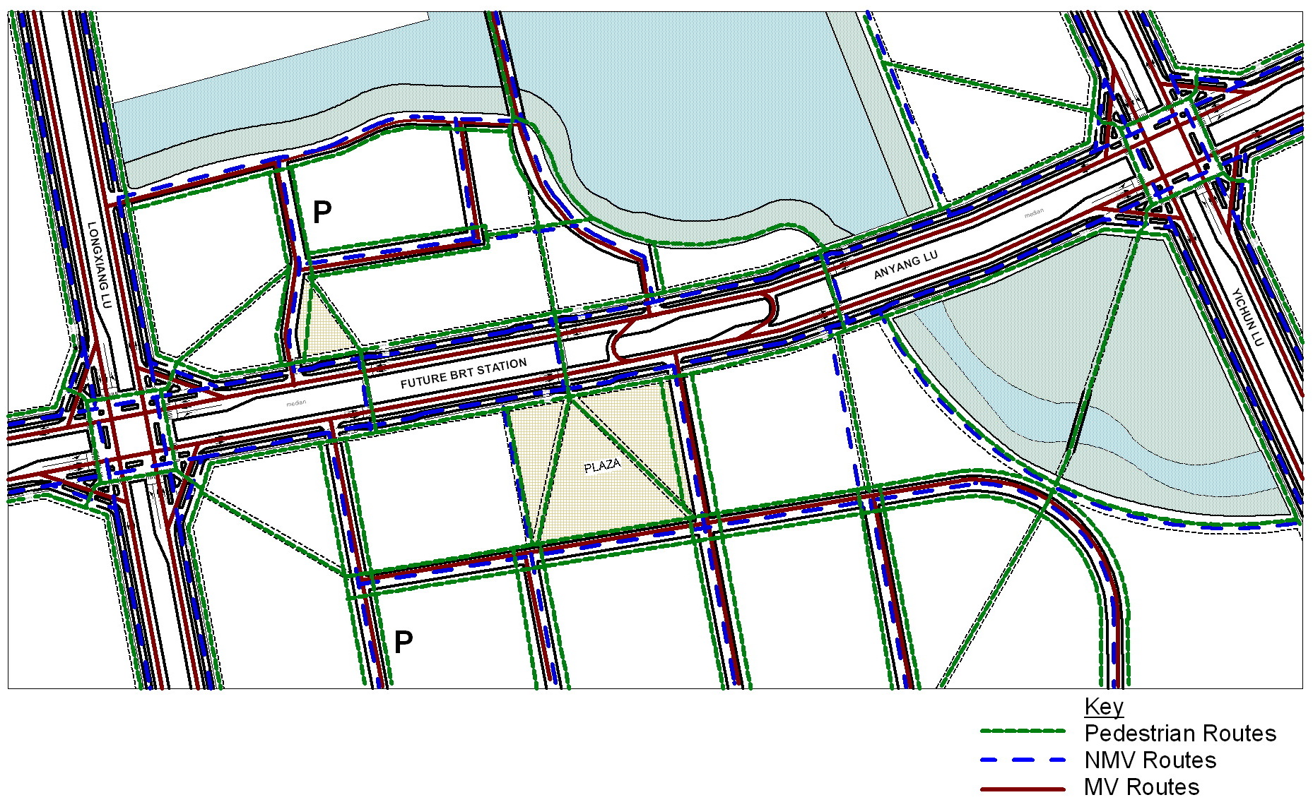
District street network detail
This diagram shows detail of the Qunli District street network plan. All modes are shown, where they intersect, how they cross plazas and parks, and other details. The idea is to expand on the simplistic street map.
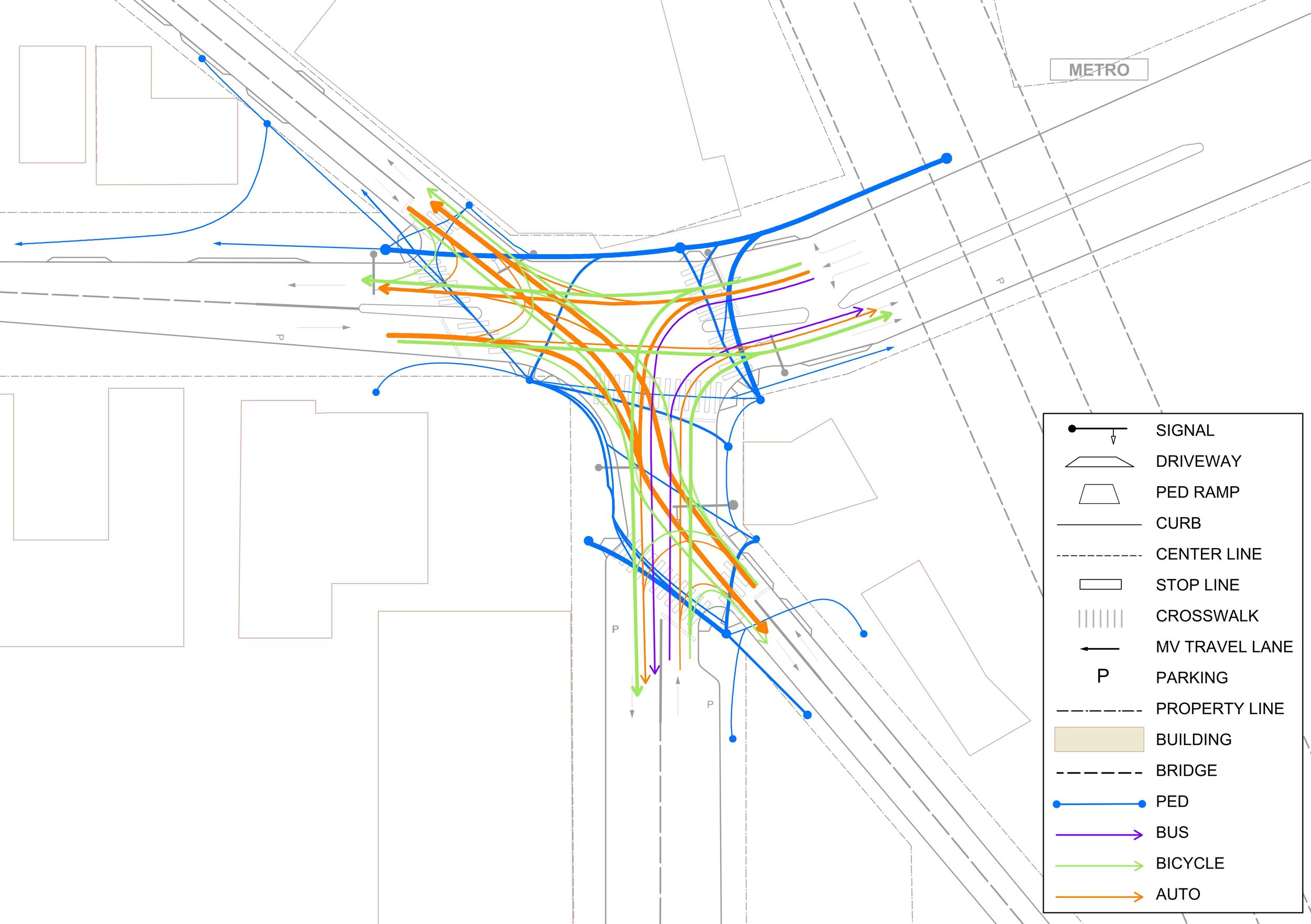
Intersection flow diagram
This diagram from the NACTO USDG articulates all the potential movements at a particular intersection. Blue is walking, green cycling, purple transit, and orange driving. Note that the routes, especially those of people walking, are not necessarily always “standard”.
Street classification map
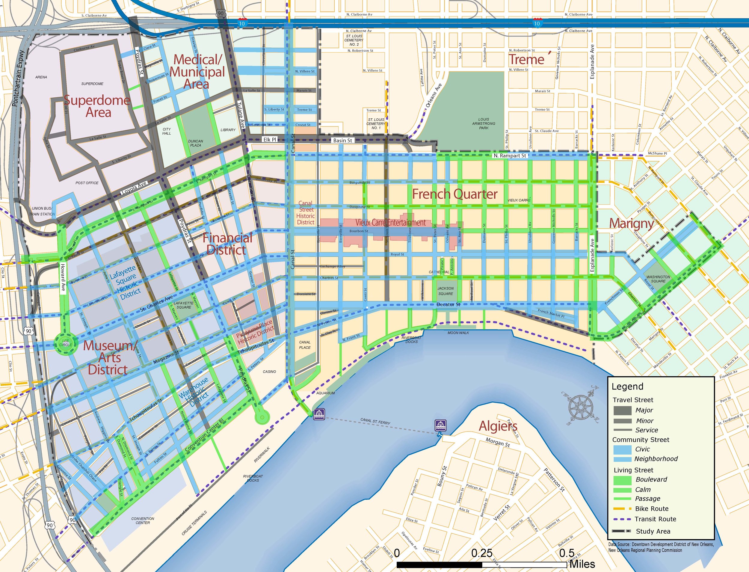
Street classification map from the New Orleans LA Downtown Mobility Plan. It breaks free of the traditional arterial-collector-local orthodoxy, instead opting for Travel Streets, Community Streets, and Living Streets.
Volume per lane
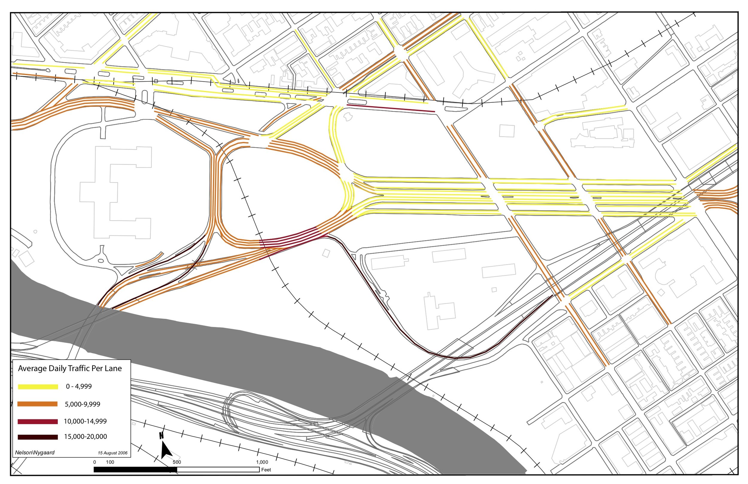
This is a technique we use to illustrate congestion on a roadway. Typically the total volume (average daily traffic, ADT) is shown on a map of a street. While this is fine at a macro-level, to really understand the amount of traffic on a street, one needs to divide total volume by number of lanes. This is a classic case of providing a denominator for a numerator.
In this example from Philadelphia PA, the main section of the parkway has 6 lanes, while the on-ramp to the highway only has 1. The latter is shown in brown as it is more “congested”.
We use this to help practitioners and the public understand traffic.
Realistic five minute catchment area
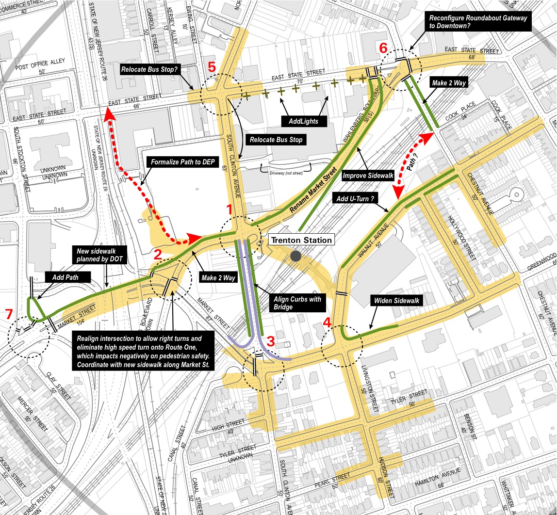
The most universal way to describe a catchment area is time - how far you can get in xx minutes. In this example from Trenton NJ, the streets shown in yellow are those that can be reached in five minutes. The distances are not all the same, as one has to wait for traffic signals, or has to go around a large block.
